Uncover

Mobile app

Background

There's a moment most music lovers know. You hear a song and something stops you. Later you find out it's a cover and that discovery opens a door. Suddenly you're tracing a song back through decades of artists, each with their own take on it. One song becomes ten. Ten becomes a rabbit hole.
Uncover is built for that moment.

Problem

No platform is built for the cover song journey. Spotify and Apple Music are built for passive consumption. YouTube gets closer, but covers compete for space with tutorials and vlogs. There's no dedicated space for cover culture, no way to trace a song's lineage.The problem isn't just that covers are hard to find. It's that music has hidden layers: history, lineage, connection across generations and no platform is built to surface them.

The Users

andrew-davie-h0qUAPHoXmE-unsplash 1

Lara, 16 - The Listener

Lara found her favourite artist through a cover. Now she has covers scattered across YouTube, TikTok and Spotify with no way to bring them together. She wants a home for that part of her music taste.

Simon, 21 - The Creator

Simon has been recording covers in his bedroom for two years. They get lost in the noise of platforms not built for music discovery. He doesn’t want fame, he wants to find the people who’ll genuinely connect with his interpretation.

Simon and Lara represent the two sides of cover culture, the people who make them and the people who need them.

The Process

Before touching Figma, a full UX document was built defining the problem, users, scope and flows. The tension between Simon’s need for reach and Lara’s need for curation became the central design challenge.
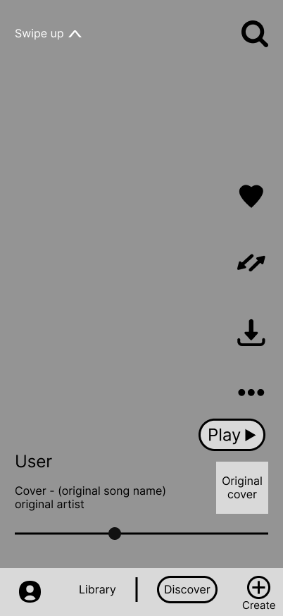
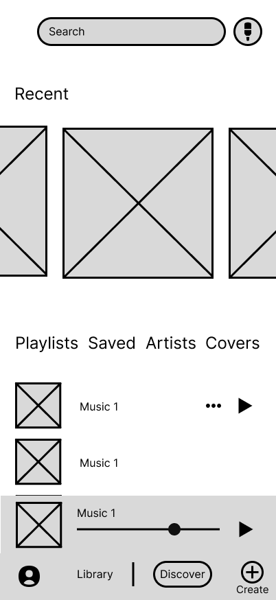
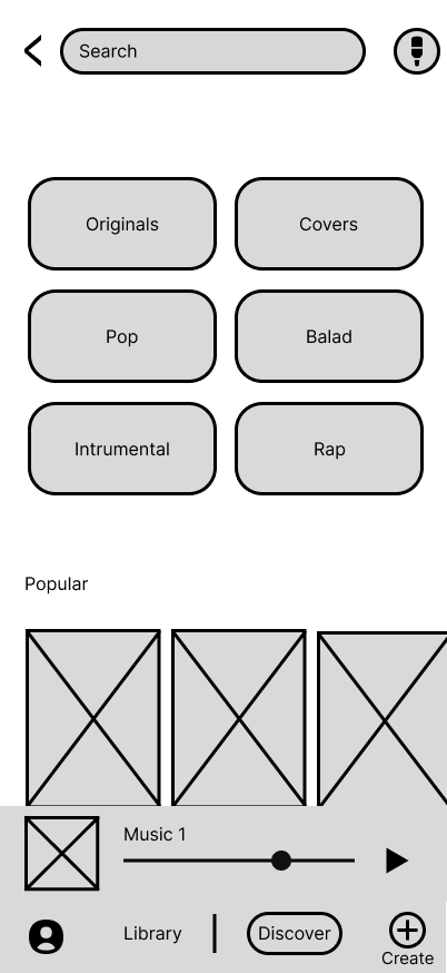
Six screens were wireframed across multiple iterations. The most important early decision was making the Social Hub the home screen, discovery first, everything else second.
Visually, the project started pointing toward high energy and youth. But as the design evolved, something more specific emerged: the feeling of stumbling onto an artist at 2am, flipping through a record store with no agenda. That shift became the north star for every decision that followed.
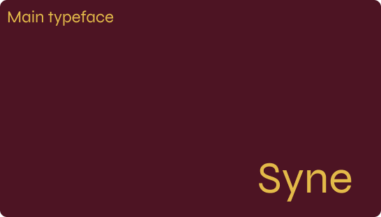
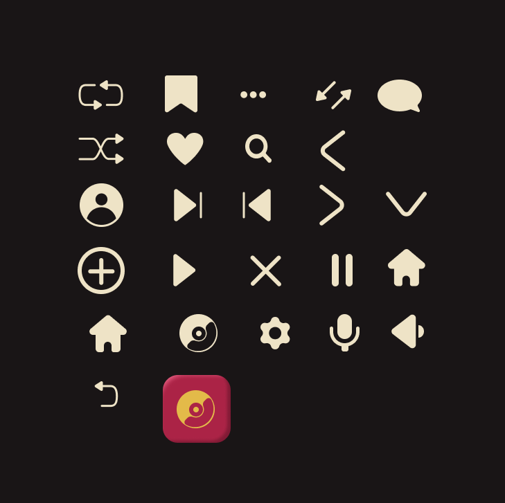
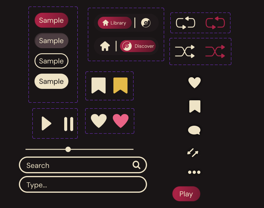
A full design system with colour, typography, iconography and components was built before a single final screen was designed.

The Solution

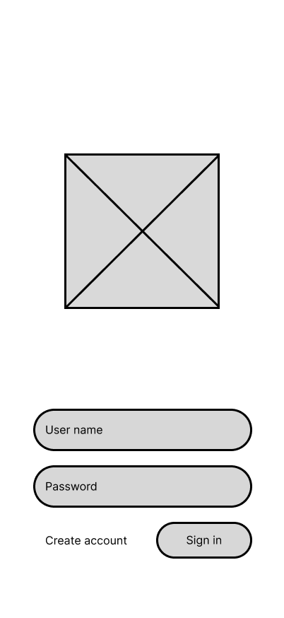
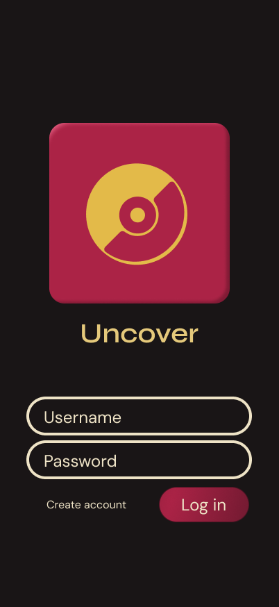
Log In – The vinyl is the first thing you see. Minimal and immediate, no friction between you and the music.
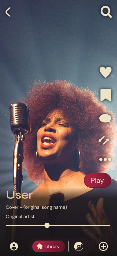
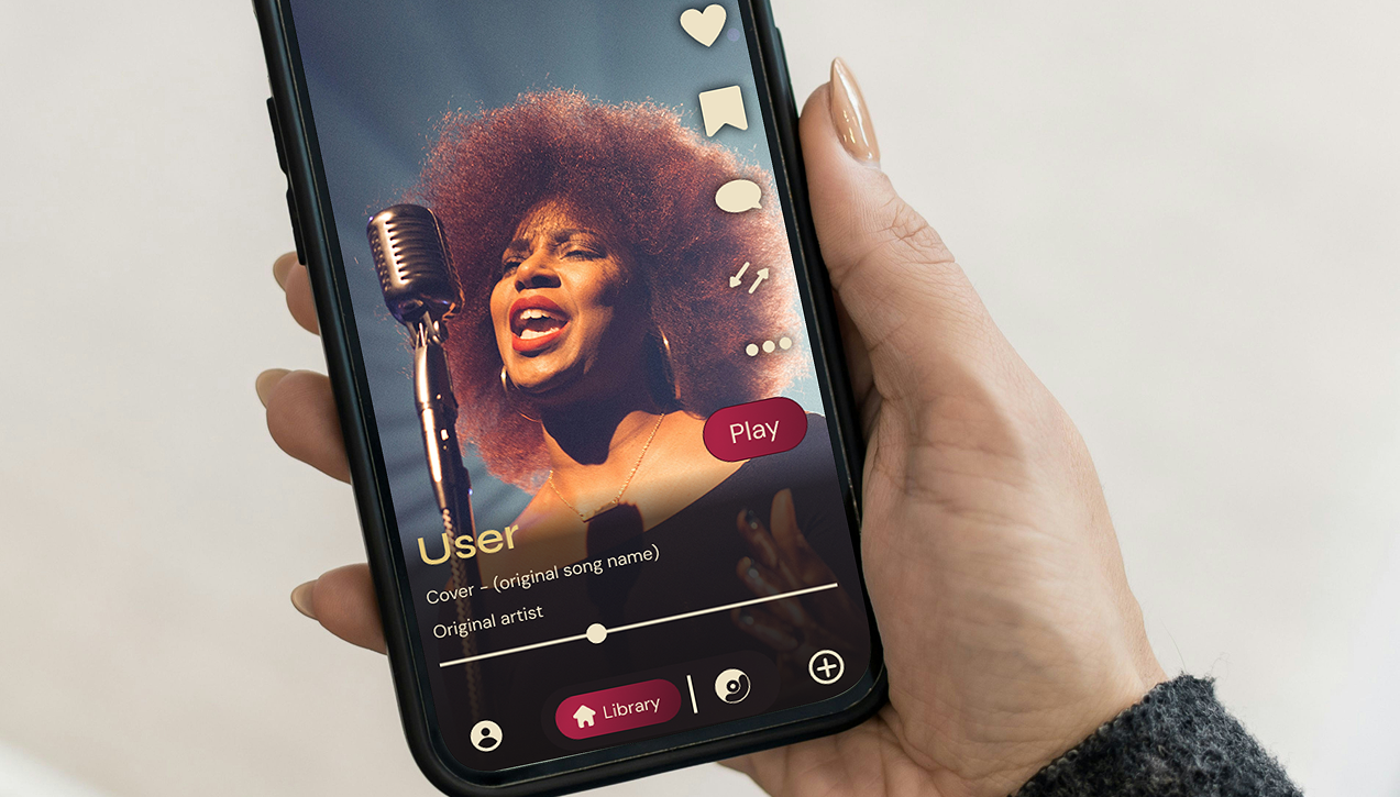
Social Hub – You land in a full-screen feed of cover clips. Scroll to discover. The creator’s name is always in gold, because in Uncover, the person behind the cover matters as much as the song.
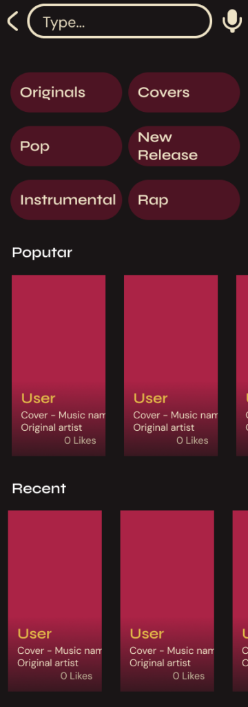
Search – A single toggle before you type: Originals or Covers. That choice reframes the entire search experience around the app’s core concept.
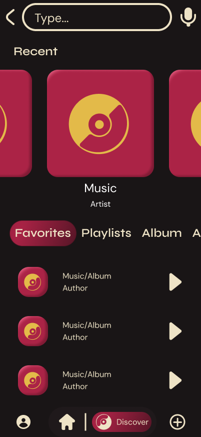
Library – Covers sit as a first-class tab alongside Favourites, Playlists and Albums. Not buried. Not an afterthought.
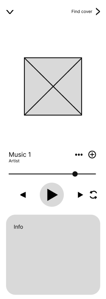
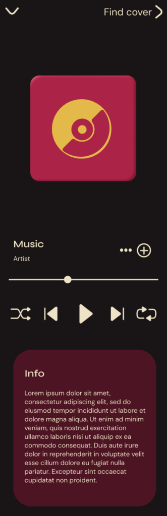
Player – Every song has a Find Cover button. One tap changes the relationship between listener and song.
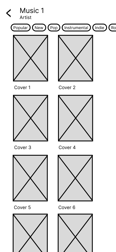
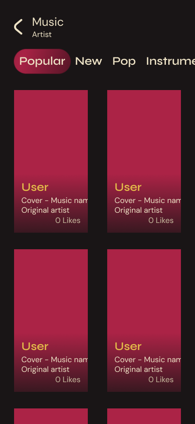
Cover Search – Every known cover, filterable by genre, mood and popularity. The rabbit hole, made navigable.

Reflection

The best insight from this project wasn’t a visual decision, it was realising the app needed a soul before it needed a style.
Building the design system before the final screens was the single best process decision. Every screen was faster and more consistent because the foundations were solid.
What I’d do differently: involve real users earlier. Both personas were built from intuition rather than interviews. The next version starts with at least five conversations before a wireframe is drawn.
Uncover started as a portfolio project. Somewhere along the way it became something I’d actually want to use.

Diogo Fernandes

Let's build something worth using.

All Rights Reserved