O'Cunha

WebSite

Background

O'Cunha is a barbershop and pub in Caldas das Taipas, Guimarães, a local institution occupying a stone building on a cobbled street. The interior splits between two worlds: a classic barbershop with vintage wooden cabinets, and an Irish-inspired pub with a Chesterfield sofa, wooden plank walls and banknotes pinned to the ceiling. Both sides share the same unhurried, welcoming atmosphere.
The business had no website. Only a booking page through buk.pt, accessed via Google Maps.
Problem

The existing booking page is purely transactional, a generic form that communicates nothing about what O’Cunha actually is. Anyone discovering the business online gets no sense of the atmosphere, the dual identity, or the community feel that makes it worth visiting.
Success for this project had one clear definition: a website that makes someone want to walk through the door before they’ve read a single word about services or prices.

The Users

Three types of visitor shaped every design decision:

The Regular – already a customer, arriving via Google Maps on mobile. Needs booking to be fast and frictionless.

The Curious Local – has heard about O’Cunha but never been in. Needs to feel what the place is like and be convinced it’s worth visiting.

The Out-of-Towner – searching for a barbershop nearby. Needs practical information alongside enough personality to choose O’Cunha over a generic alternative.

What all three share: they need an immediate sense of the atmosphere before anything else.

Design Direction

The north star was a specific feeling, walking into your favourite local on a quiet evening. Warm, unhurried, familiar.
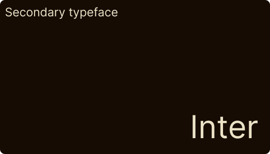
The visual language was drawn from old Portuguese taverns, vintage Irish pub interiors and aged print design. The existing logo, a black background, white serif wordmark and gold line accents became the foundation for the palette: warm cream, deep black, gold, and a supporting amber pulled from the bar photography.
Tone of voice: warm and direct, like the owner talking to a regular. Portuguese throughout. No marketing speak, short sentences, confident, unpretentious.
Interactions are minimal and purposeful: slow parallax on the hero, smooth scroll between sections, nothing that competes with the atmosphere.

The Solution

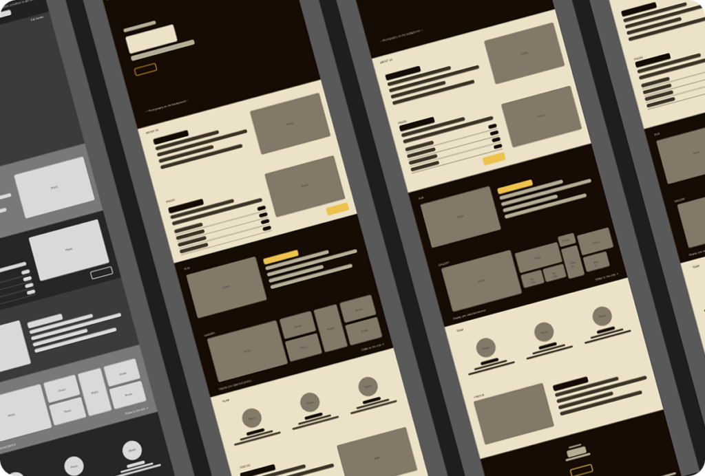
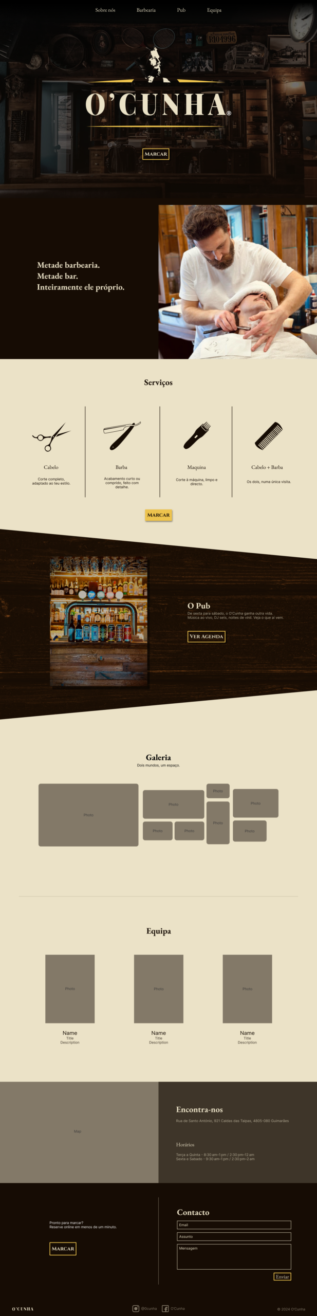
A single-page desktop and mobile website, structured to take the visitor on a natural journey through the space:

Hero – full screen, atmosphere-first, logo, one line, book now.


About us – the story and what makes O’Cunha a local institution.


Barber – services, prices, the craft.


Pub – the bar side and its atmosphere.


The Space – a gallery mixing both worlds.
The Team – Pedro and Luís.

Find us – location, hours, contact.


Booking – final CTA, always one tap away.

A sticky navigation bar keeps booking accessible throughout. The language stays Portuguese, authentic to the place and its community.

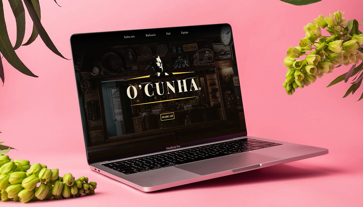
Web version

Phone version

Reflection

The main challenge with O’Cunha wasn’t visual, it was restraint. The temptation with atmosphere-led design is to over-style it. Every decision had to earn its place by serving the feeling, not decorating it.
Having visited as a customer before starting the project made a real difference. The design decisions weren’t made from photography and inference, they came from an actual memory of the place. The light, the pace, the way the two sides of the space coexist without competing. That grounded everything.
What I’d do differently: involve Pedro and Luís earlier. The website was designed as a concept without direct input from the owners, which meant some assumptions about tone and priorities that real conversations would have resolved. The next version starts with a proper client brief.
The project started as a way to give a local institution the online presence it deserves. It ended up being one of the more personally meaningful projects in the portfolio, designing something for a place you actually know hits differently.

Diogo Fernandes

Let's build something worth using.

All Rights Reserved